There are a number of excellent coronavirus tracking websites (see list below) and many of them are making their data sources available. I found myself jumping between pages and sites, doing a few calculations I was interested in, and then emailing my analysis to friends and family. After a few weeks of this, I finally decided to move some of that analysis to the web.
Updated:
Data as of: 28-November-20201
tl;dr2 summary
Just The Data:
United States for 28-November-20201:
-
Total Positive Tests: 13,054,593; Total Tests: 189,871,827; Average Test-Positivity: 6.9%; National Tests per 1k. pop: 578
-
New Positive Tests: 153,447; Peak New Positive Tests: 194,979 [on 27-Nov-2020]; 7-Day Average New Cases: 160,847
-
Daily Test Total: 1,698,332; Daily Test-Positivity: 9.0%
-
Daily Tests, Trailing 7-Day Avg.: 1,715,549; Test-Positivity, Trailing 7-Day Avg.: 9.5%
-
Total Fatalities: 257,119; Case Fatality Rate: 2.0%
-
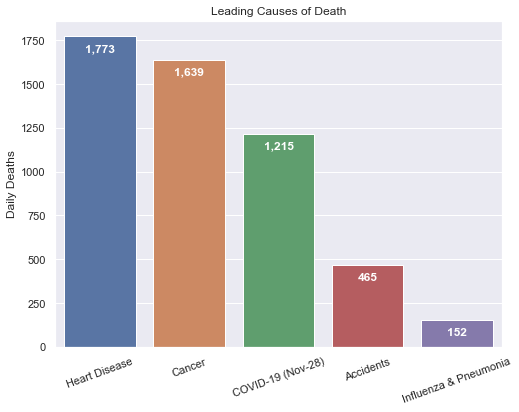
New Fatalities: 1,215; Peak Fatalities: 2,753 [on 07-May-2020]
FYI: This site treats positive tests to be an approximation for cases, and may use cases and positive tests interchangeably.
Monthly Data
| Month | New Cases per month |
New Cases dly avg |
DGR avg |
GF avg |
Total Tests per month |
T-Pos avg |
Tests per 1k |
Deaths | Death per 100k |
CFR avg |
In ICU dly avg |
|---|---|---|---|---|---|---|---|---|---|---|---|
| Mar | 197,672 | 7,321 | 27.7% | 1.26 | 1,142,131 | 17.3% | 3.5 | 4,316 | 1.3 | 2.2% | 2,382 |
| Apr | 875,807 | 29,194 | 5.8% | 1.01 | 5,392,790 | 16.2% | 16.4 | 55,267 | 16.8 | 6.3% | 12,069 |
| May | 717,453 | 23,144 | 1.7% | 1.00 | 11,191,221 | 6.4% | 34.1 | 40,901 | 12.5 | 5.7% | 10,315 |
| Jun | 832,776 | 27,759 | 1.3% | 1.03 | 16,107,180 | 5.2% | 49.1 | 19,577 | 6.0 | 2.4% | 5,947 |
| Jul | 1,898,079 | 61,228 | 1.8% | 1.02 | 25,257,780 | 7.5% | 76.9 | 25,277 | 7.7 | 1.3% | 7,446 |
| Aug | 1,452,954 | 46,869 | 0.9% | 0.98 | 24,935,807 | 5.8% | 76.0 | 30,273 | 9.2 | 2.1% | 8,858 |
| Sep | 1,190,459 | 39,682 | 0.6% | 1.03 | 26,892,916 | 4.4% | 81.9 | 23,308 | 7.1 | 2.0% | 6,375 |
| Oct | 1,883,216 | 60,749 | 0.8% | 1.03 | 35,413,452 | 5.3% | 107.9 | 23,395 | 7.1 | 1.2% | 7,511 |
| Nov | 4,005,898 | 143,068 | 1.3% | 1.03 | 43,530,344 | 9.2% | 132.6 | 34,789 | 10.6 | 0.9% | 13,832 |
You can find column heading definitions in the state level snapshot section below.
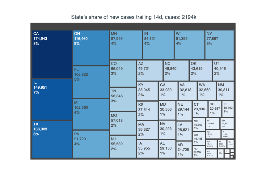
New Cases over the last 14 Days
My take
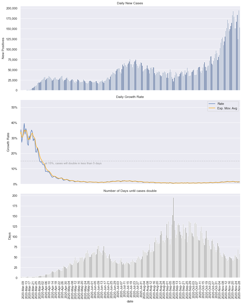
It seems the path forward will be a roller coaster of progress and regression (the growth factor moving average demonstrates this), as result, my commentary will be less focused on day to day changes. While the daily trends are variable, the big trends are positive (April was better than March), but the small trends are volatile (a single day may be better or worse than the day before). I think the growth factor moving average chart tells the story most succinctly.
FYI: My list of Coronavirus Tracking sites and data sources.
Impact in Lives Lost
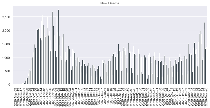
To put this daily death total in perspective, according to the CDC mortality data3, there were 2,813,503 deaths in 2017.
The leading causes:
| Cause | Total Deaths |
|---|---|
| Heart Disease | 647,457 |
| Cancer | 599,108 |
| Accidents | 169,936 |
Influenza & Pneumonia is the 8th highest leading cause of death with 55,672 deaths in 2017.
Given we are still in the early days of the outbreak, the rate of change is more telling then the cumulative totals. To compare mortality, compute the average deaths per day for each leading cause and compare to the daily death count for COVID-19.
Spread / Containment
The data shows physical distancing is working. The macro trend is that the daily growth rate is decreasing, and subsequently the number of days until the case count doubles is also improving, i.e. increasing.
The daily growth rate is now stabilizing well below 2%, with the 3-day moving average currently at 1.3%.
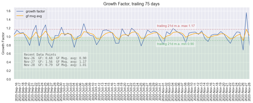
Growth Factor
Growth factor is a measure of how quickly the infection (new cases daily) is growing. You can think of this as a daily multiplier, that is, what do you need to multiply yesterday’s new case count by in order to reach today’s new case count. For example, if yesterday’s new case count were 437 and the growth factor were 1.2, then today’s case count would be 524, and the infection would be spreading rapidly, or if the growth factor were 0.8 then todays case count would be 350, and the infection would be dying down.
A growth factor < 1 (green area on chart), means there are fewer cases today then yesterday, and If we can keep that up long-enough, the outbreak will die down. In a perfect world the growth factor would approach 0, meaning no new cases.
Growth Factor4 is calculated as a ratio of new cases today compared to new cases yesterday.
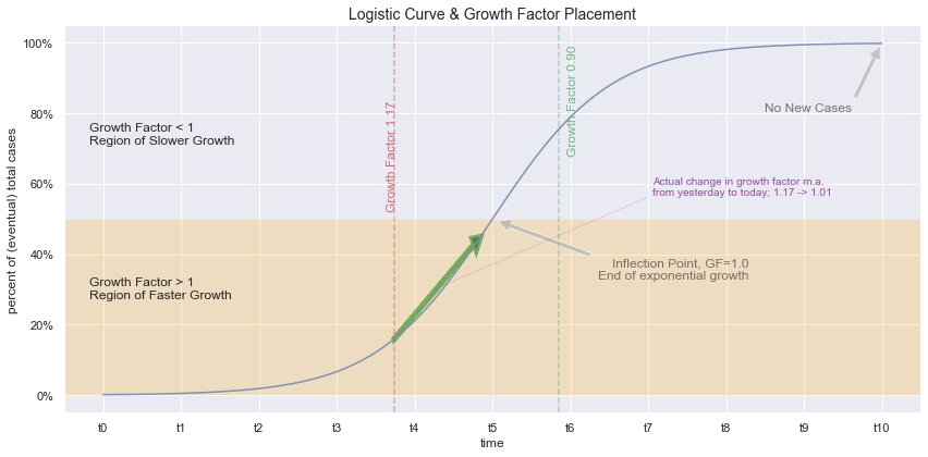
Repeated multiplication results in exponential growth, however pandemics will not grow exponentially forever. At some point the growth will shift to linear growth, and eventually, the growth will level out or stop. The resulting shape of combining these properties is a logistic curve. The growth factor is also the instantaneous slope of a point on the logistic curve. We can plot points based on growth factor values to estimate where we might be on the trajectory of the pandemic.
Since growth factor is the daily multiplier we can use this value to estimate how long until we are below some threshold number of daily new cases.
Aiming at a daily target below 1,000 new cases and given the recent 4d average Growth Factor (daily multiplier) of 1.01, we will never get below 1,000 new cases daily. (For reference, a growth factor of 0.75 would reach the 1,000 new case threshold in 17.5 days).
All models are wrong, but some are useful.
George Box
See notes5 6 for more details on logistic curve and growth factor.
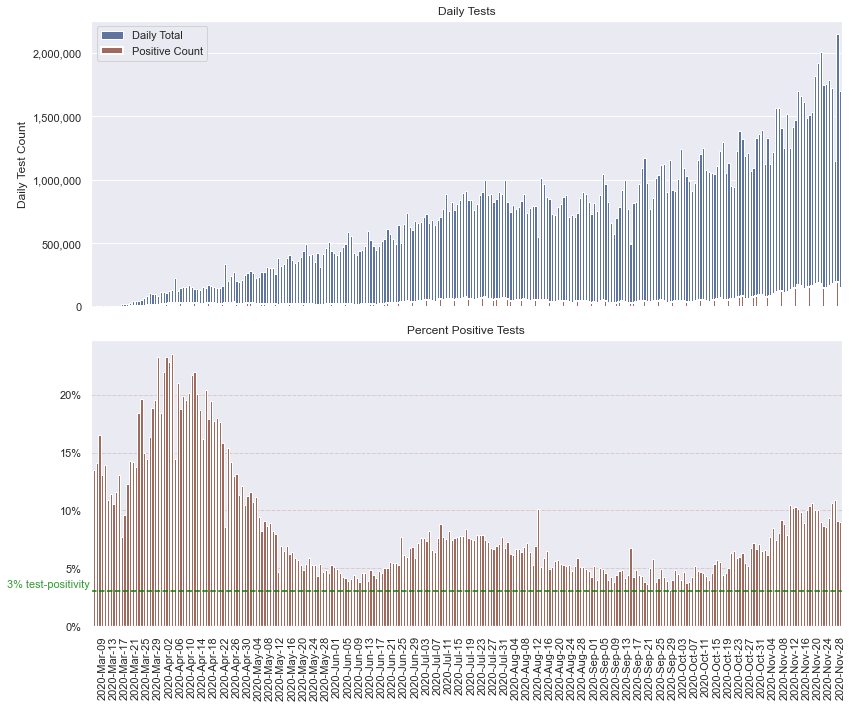
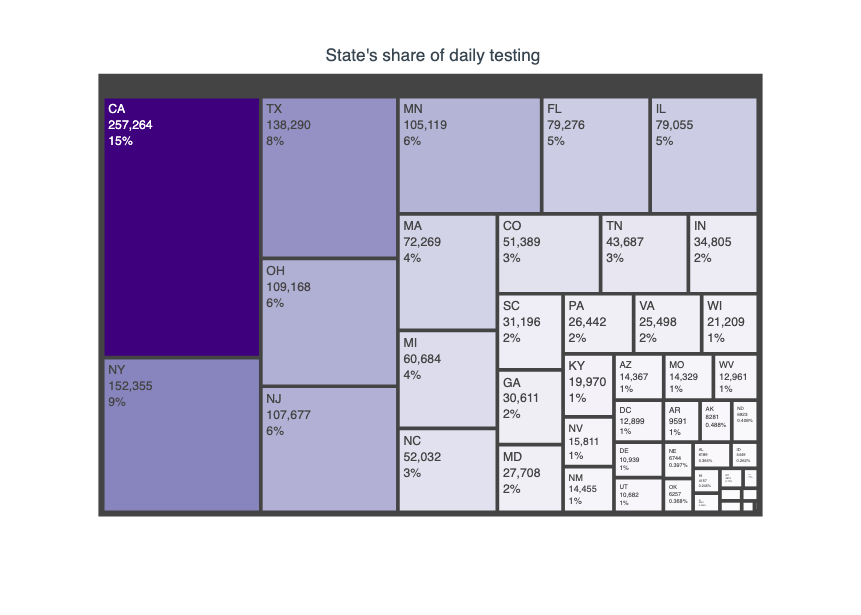
Testing Snapshot
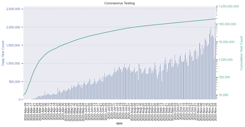
Thought experiment on testing: There are roughly 17,000,000 health care workers in the U.S.7. The average incubation period of coronavirus is around 5 days8. Until treatments are available, to keep our healthcare workers safe, a weekly test seems pragmatic. 17 million divided by 7 days is roughly 2.4 million tests per day, or 3.4 million tests per day if we test every 5 days. This thought experiment is only to suggest the scale of testing that might be necessary for effective public health management as part of a strategy to relax physical distancing restrictions.
How much testing is enough?
One measure might be the proportion of positive tests as a share of total testing. We know that asymptomatic contagious individuals are making this outbreak particularly challenging to deal with. Any attempt to identify the asymptomatic carriers of the disease will require testing many healthy people, who are also asymptomatic. The impact of testing more asymptomatic people, would drive down the number of positive tests as more healthy people are tested.
There is some guidance that indicates a 3% test-positivity rate is necessary to control the pandemic.9
The below graph shows the number of positive tests as a proportion of total testing.
Comparison to other Countries10:
USA - Case Fatality Rate: 2.0%, Test-Positivity: 6.9%, Test per 1k pop: 578
| Country | Pop. | Cases | Test Positivity | Case Fatality Rate | Test Per 1k Pop |
|---|---|---|---|---|---|
| Taiwan | 23.8 M | 455 | 0.6% | 1.5% | 3 |
| S. Korea | 51.3 M | 13,771 | 0.9% | 2.1% | 29 |
| Iceland | 0.3 M | 1,930 | 1.7% | 0.5% | 332 |
| UK | 67.9 M | 294,792 | 2.2% | 15.4% | 196 |
| Germany | 83.8 M | 202,845 | 2.9% | 4.5% | 82 |
| Russia | 145.9 M | 771,546 | 3.1% | 1.6% | 171 |
| Canada | 37.8 M | 110,338 | 3.1% | 8.0% | 93 |
| Italy | 60.5 M | 244,434 | 3.9% | 14.3% | 103 |
| India | 1,380.7 M | 1,118,107 | 8.1% | 2.5% | 10 |
| Sweden | 10.1 M | 77,281 | 11.3% | 7.3% | 67 |
Test positivity is measured with aggregate test data unless noted otherwise.
Thought experiment on test-positivity: If we use 3% as a threshold for relaxing physical distancing, there are two levers we can pull to reach it; (1) decrease the number of new positive tests ( aka continue with physical distancing measures), (2) increase the number tests completed each day.
Assuming a testing capacity around 800,000 test per day, 3% of that number is 24,000. To reach 3% positive test proportion, we’d need to keep physical distancing guidelines in place until the number of new cases falls to 24,000 per day.
Alternatively, using 60,000 as the average number of new cases, we’d need 2,000,000 total daily tests, with all additional tests to be negative, for the proportion of positive results to be 3%.
Ideally we will make progress on both strategies.
State Level Snapshot
Field definitions:
Generally a * means this metric is a moving-average.
StateState code, followed by that state’s contribution to the total number of new cases as a percent.Pop.is state population in millionsCasesis the total number of cases measured by positive test resultsNew.CNew Cases. Lower is better.DGR*Daily Growth Rate. This is 7-day, exponential moving average. Lower is better.Tests per 1kis number of tests per 1,000 in state’s population. Higher is better.T-Pos.is the test-positivity percentage; ratio of positive tests to total tests. Lower is better.Fat.Total number of fatalitiesFat./1Mnumber of deaths per 1 million in populationCFR*Case Fatality Rate. Exponential moving average with a 7-day span.GF*Growth Factor, 7-day span, exponentially weighted moving average. Todays value has more weight, than the measure of 4 days ago. Lower is better.
-GF-14daySummation of GF-m.a. from last 14 days. The lower the better. Values below 14 indicate exponential has stopped.Dbl.DaysGiven the current daily growth rate, how many days until cases double. Higher is better.CDDConsecutive days of declining new cases or new cases at or below a threshold of 5.11 A value greater than 14, might signal preparedness to reopen. This may be too rigorous, see notes11 for more detail.-
As-Of Datethe date when the data was last modified SparkLinesThe embedded graphs in the table are a plot of the last 14-days of the metric in question. For example, in theCasescolumn, the sparkline shows visually how the total number of cases has changed over the last 14 days. Similar metrics share a color; metrics related to cases are gray, testing are brown, fatalities are blue, and (exponential) growth are black.
| State | Pop. | Cases | New C. | DGR* | Test/1k | T-Pos. | Fat. | Fat./1M | CFR* | GF* | GF-14day | Dbl.Days | CDD |
|---|---|---|---|---|---|---|---|---|---|---|---|---|---|
| AK ( 0%) | 0.7 M | 30,204  |
650  |
2.2%  |
1366  |
3.0%  |
121  |
165 |
0.4%  |
1.0  |
14.3  |
31  |
1 |
| AL ( 1%) | 4.9 M | 244,993  |
2,119  |
0.9%  |
321  |
15.6%  |
3,572  |
729 |
1.5%  |
1.3  |
14.8  |
81  |
0 |
| AR ( 1%) | 3.0 M | 155,026  |
1,349  |
1.1%  |
552  |
9.3%  |
2,449  |
812 |
1.6%  |
1.0  |
13.6  |
64  |
0 |
| AS ( 0%) | 0.0 M | 0  |
0  |
nan%  |
40  |
0.0%  |
0  |
0 |
0.0%  |
nan  |
nan  |
nan  |
243 |
| AZ ( 3%) | 7.3 M | 322,774  |
4,136  |
1.3%  |
305  |
14.6%  |
6,624  |
910 |
2.1%  |
1.1  |
16.9  |
54  |
1 |
| CA ( 8%) | 39.5 M | 1,183,320  |
11,996  |
1.2%  |
597  |
5.0%  |
19,089  |
483 |
1.7%  |
1.0  |
15.1  |
59  |
3 |
| CO ( 3%) | 5.8 M | 225,283  |
4,330  |
2.3%  |
546  |
7.2%  |
2,521  |
438 |
1.2%  |
1.0  |
14.3  |
31  |
0 |
| CT ( 0%) | 3.6 M | 112,581  |
0  |
1.3%  |
885  |
3.6%  |
4,961  |
1,391 |
4.5%  |
0.7  |
11.7  |
52  |
1 |
| DC ( 0%) | 0.7 M | 21,308  |
371  |
1.1%  |
971  |
3.1%  |
678  |
961 |
3.3%  |
1.3  |
16.2  |
65  |
0 |
| DE ( 0%) | 1.0 M | 34,670  |
500  |
1.5%  |
740  |
4.8%  |
763  |
784 |
2.3%  |
1.1  |
15.6  |
46  |
1 |
| FL ( 4%) | 21.5 M | 969,813  |
6,062  |
0.8%  |
571  |
7.9%  |
18,677  |
870 |
2.0%  |
0.7  |
14.6  |
83  |
1 |
| GA ( 2%) | 10.6 M | 418,936  |
2,633  |
0.6%  |
404  |
9.8%  |
9,424  |
888 |
2.3%  |
1.1  |
16.0  |
113  |
0 |
| GU ( 0%) | 0.2 M | 6,782  |
14  |
0.6%  |
494  |
8.1%  |
112  |
665 |
1.6%  |
0.9  |
18.0  |
121  |
4 |
| HI ( 0%) | 1.4 M | 18,082  |
76  |
0.6%  |
466  |
2.7%  |
240  |
170 |
1.3%  |
1.0  |
14.8  |
120  |
1 |
| IA ( 1%) | 3.2 M | 199,683  |
1,461  |
1.1%  |
337  |
18.8%  |
2,360  |
748 |
1.2%  |
1.1  |
14.4  |
63  |
0 |
| ID ( 1%) | 1.8 M | 98,500  |
1,997  |
1.4%  |
262  |
21.0%  |
909  |
509 |
0.9%  |
0.8  |
14.5  |
48  |
0 |
| IL ( 5%) | 12.7 M | 712,936  |
7,873  |
1.4%  |
818  |
6.9%  |
12,838  |
1,013 |
1.8%  |
1.0  |
14.1  |
48  |
0 |
| IN ( 3%) | 6.7 M | 329,008  |
4,471  |
1.9%  |
621  |
7.9%  |
5,663  |
841 |
1.8%  |
0.9  |
14.2  |
37  |
2 |
| KS ( 0%) | 2.9 M | 153,021  |
0  |
1.7%  |
279  |
18.8%  |
1,529  |
525 |
1.0%  |
0.0  |
-0.0  |
41  |
1 |
| KY ( 2%) | 4.5 M | 174,182  |
2,427  |
1.8%  |
570  |
6.8%  |
1,885  |
422 |
1.1%  |
0.7  |
14.2  |
39  |
1 |
| LA ( 0%) | 4.6 M | 230,602  |
0  |
0.8%  |
727  |
6.8%  |
6,391  |
1,375 |
2.8%  |
0.6  |
16.5  |
86  |
1 |
| MA ( 2%) | 6.9 M | 222,469  |
3,217  |
1.3%  |
1208  |
2.7%  |
10,676  |
1,549 |
5.0%  |
0.8  |
13.9  |
52  |
1 |
| MD ( 1%) | 6.0 M | 194,448  |
1,590  |
1.1%  |
722  |
4.5%  |
4,602  |
761 |
2.4%  |
1.0  |
14.6  |
61  |
1 |
| ME ( 0%) | 1.3 M | 11,288  |
23  |
1.2%  |
626  |
1.3%  |
191  |
142 |
1.7%  |
0.8  |
14.4  |
55  |
0 |
| MI ( 5%) | 10.0 M | 378,152  |
8,351  |
2.4%  |
658  |
5.8%  |
9,467  |
948 |
2.6%  |
0.5  |
9.6  |
29  |
1 |
| MN ( 6%) | 5.6 M | 304,023  |
9,022  |
2.2%  |
714  |
7.5%  |
3,521  |
624 |
1.2%  |
1.0  |
13.9  |
32  |
0 |
| MO ( 1%) | 6.1 M | 292,740  |
2,204  |
1.3%  |
496  |
9.6%  |
3,817  |
622 |
1.3%  |
0.9  |
14.2  |
54  |
2 |
| MP ( 0%) | 0.1 M | 104  |
0  |
0.1%  |
328  |
0.6%  |
2  |
39 |
1.9%  |
0.1  |
1.8  |
949  |
42 |
| MS ( 1%) | 3.0 M | 149,940  |
1,553  |
0.9%  |
369  |
13.7%  |
3,779  |
1,270 |
2.6%  |
1.2  |
15.2  |
80  |
0 |
| MT ( 1%) | 1.1 M | 60,845  |
1,049  |
1.6%  |
604  |
9.4%  |
669  |
626 |
1.1%  |
2.9  |
16.4  |
43  |
0 |
| NC ( 2%) | 10.5 M | 357,958  |
3,444  |
1.1%  |
500  |
6.8%  |
5,219  |
498 |
1.5%  |
0.7  |
14.5  |
62  |
1 |
| ND ( 0%) | 0.8 M | 77,935  |
703  |
1.3%  |
1407  |
7.3%  |
680  |
892 |
0.9%  |
0.9  |
14.2  |
55  |
3 |
| NE ( 1%) | 1.9 M | 124,066  |
1,114  |
1.7%  |
692  |
9.3%  |
984  |
509 |
0.8%  |
1.0  |
15.1  |
41  |
1 |
| NH ( 0%) | 1.4 M | 20,002  |
689  |
2.4%  |
578  |
2.5%  |
523  |
385 |
2.8%  |
0.9  |
14.1  |
29  |
0 |
| NJ ( 2%) | 8.9 M | 330,275  |
3,802  |
1.3%  |
669  |
5.6%  |
16,965  |
1,910 |
5.3%  |
1.0  |
14.8  |
54  |
2 |
| NM ( 1%) | 2.1 M | 93,982  |
2,130  |
2.5%  |
733  |
6.1%  |
1,527  |
728 |
1.7%  |
1.0  |
14.9  |
28  |
0 |
| NV ( 2%) | 3.1 M | 149,229  |
2,912  |
1.7%  |
527  |
9.2%  |
2,119  |
688 |
1.5%  |
1.2  |
15.1  |
40  |
0 |
| NY ( 4%) | 19.5 M | 634,438  |
6,063  |
1.0%  |
983  |
3.3%  |
26,632  |
1,369 |
4.3%  |
1.0  |
14.6  |
67  |
1 |
| OH ( 4%) | 11.7 M | 406,703  |
6,895  |
2.4%  |
516  |
6.7%  |
6,378  |
546 |
1.6%  |
0.7  |
13.8  |
29  |
1 |
| OK ( 4%) | 4.0 M | 193,824  |
6,257  |
2.0%  |
522  |
9.4%  |
1,717  |
434 |
0.9%  |
1.2  |
14.5  |
35  |
0 |
| OR ( 1%) | 4.2 M | 72,506  |
1,674  |
1.9%  |
245  |
7.0%  |
896  |
212 |
1.3%  |
1.2  |
14.6  |
36  |
0 |
| PA ( 5%) | 12.8 M | 351,667  |
8,053  |
2.2%  |
247  |
11.1%  |
10,275  |
803 |
3.1%  |
1.1  |
14.7  |
31  |
0 |
| PR ( 1%) | 3.2 M | 51,581  |
903  |
1.7%  |
112  |
14.4%  |
1,083  |
339 |
2.1%  |
1.4  |
17.3  |
42  |
1 |
| RI ( 0%) | 1.1 M | 53,954  |
0  |
1.3%  |
1434  |
3.6%  |
1,346  |
1,271 |
2.6%  |
0.6  |
14.7  |
52  |
1 |
| SC ( 1%) | 5.1 M | 214,911  |
1,791  |
0.7%  |
460  |
9.1%  |
4,346  |
844 |
2.0%  |
0.8  |
13.8  |
95  |
1 |
| SD ( 1%) | 0.9 M | 79,099  |
819  |
1.4%  |
368  |
24.3%  |
942  |
1,065 |
1.1%  |
0.7  |
13.4  |
48  |
1 |
| TN ( 4%) | 6.8 M | 363,466  |
6,750  |
1.3%  |
655  |
8.1%  |
4,541  |
665 |
1.3%  |
1.3  |
16.6  |
54  |
0 |
| TX ( 3%) | 29.0 M | 1,151,069  |
4,024  |
0.8%  |
367  |
10.8%  |
21,309  |
735 |
1.9%  |
1.0  |
14.8  |
91  |
0 |
| UT ( 1%) | 3.2 M | 192,087  |
2,043  |
1.6%  |
564  |
10.6%  |
863  |
269 |
0.5%  |
0.6  |
13.9  |
44  |
1 |
| VA ( 2%) | 8.5 M | 233,617  |
3,173  |
1.1%  |
386  |
7.1%  |
4,054  |
475 |
1.8%  |
1.2  |
15.4  |
62  |
0 |
| VI ( 0%) | 0.1 M | 1,538  |
17  |
0.5%  |
266  |
5.4%  |
23  |
217 |
1.5%  |
1.4  |
12.5  |
134  |
0 |
| VT ( 0%) | 0.6 M | 4,033  |
28  |
2.0%  |
877  |
0.7%  |
67  |
107 |
1.7%  |
0.6  |
15.3  |
34  |
1 |
| WA ( 3%) | 7.6 M | 158,167  |
4,261  |
1.8%  |
380  |
5.5%  |
2,703  |
355 |
1.8%  |
0.5  |
11.7  |
38  |
0 |
| WI ( 4%) | 5.8 M | 404,999  |
5,473  |
1.3%  |
751  |
9.3%  |
3,464  |
595 |
0.9%  |
1.6  |
14.9  |
54  |
0 |
| WV ( 1%) | 1.8 M | 45,845  |
799  |
2.2%  |
622  |
4.1%  |
718  |
401 |
1.6%  |
1.0  |
14.6  |
32  |
2 |
| WY ( 0%) | 0.6 M | 31,929  |
156  |
2.0%  |
680  |
8.1%  |
215  |
371 |
0.7%  |
0.7  |
18.3  |
35  |
1 |
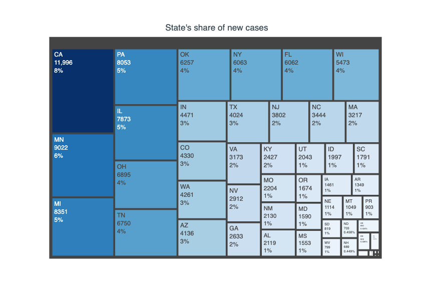
State’s share of new cases today
Fighting COVID-19
The best tools we have today
-
(Prevention) Frequent hand washing
-
(Prevention) Physical distancing
-
(Treatment) Blood plasma transfusion from people who have recovered and have COVID-19 antibodies
Johns Hopkins convalescent serum therapy
National COVID-19 Convalescent Plasma Project
More info at the Red Cross for Recovered Patients
An increasing number of people recovered, means more people can help - a single person’s blood plasma donation produces enough serum to treat 3 people.12
Hopefully coming soon, a number of vaccines and treatments. Summary of Vaccine and Treatments
Summary of Treatment Research by WHO
This is not an exhaustive list; anything missing is accidental.
Experimental Charts
I am experimenting. As a result, this section might be short-lived as I am not sure how this will be folded into the site, if at all. This section also may not be updated as frequently.
State and U.S. Territory Trends 14-day slope, 7-day slope
A measure of how a state is trending over the last 14 days and last 7 days, presented as color coded icons, one for each period. The 14 day period is the first icon and the second icon represents the 7 day period. A red up arrow means the trendline is up (positive slope), a green down arrow means the trendline is down (negative slope), a yellow horizontal arrow means the trendline is flat, a green chevron means the average daily new cases is below a threshold of 5 new cases per day; so 70 new cases in the last 14 days or 35 new cases in the last 7 days.
I think this assessment is lower order than peak coverage percentage. That is, peak cover percent is a better summary of the overall status and these arrows are just the recent trends.
- , : 23 States: AK, AZ, CA, DC, DE, FL, GA, KY, MA, MD, MI, MS, NC, NH, NJ, NV, NY, OK, OR, PA, PR, SC, WA
- , : 5 States: AL, HI, NM, OH, VA
- , : 1 States: WV
- , : 1 States: VI
- , : 7 States: AR, CO, ID, NE, SD, TN, UT
- , : 1 States: VT
- , : 16 States: CT, GU, IA, IL, IN, KS, LA, ME, MN, MO, MT, ND, RI, TX, WI, WY
- , : 2 States: AS, MP
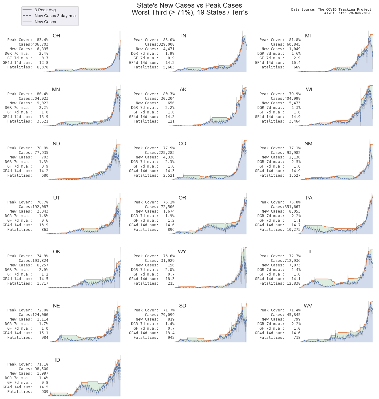
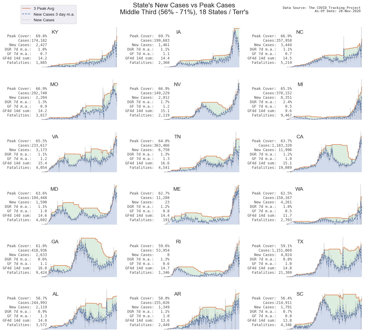
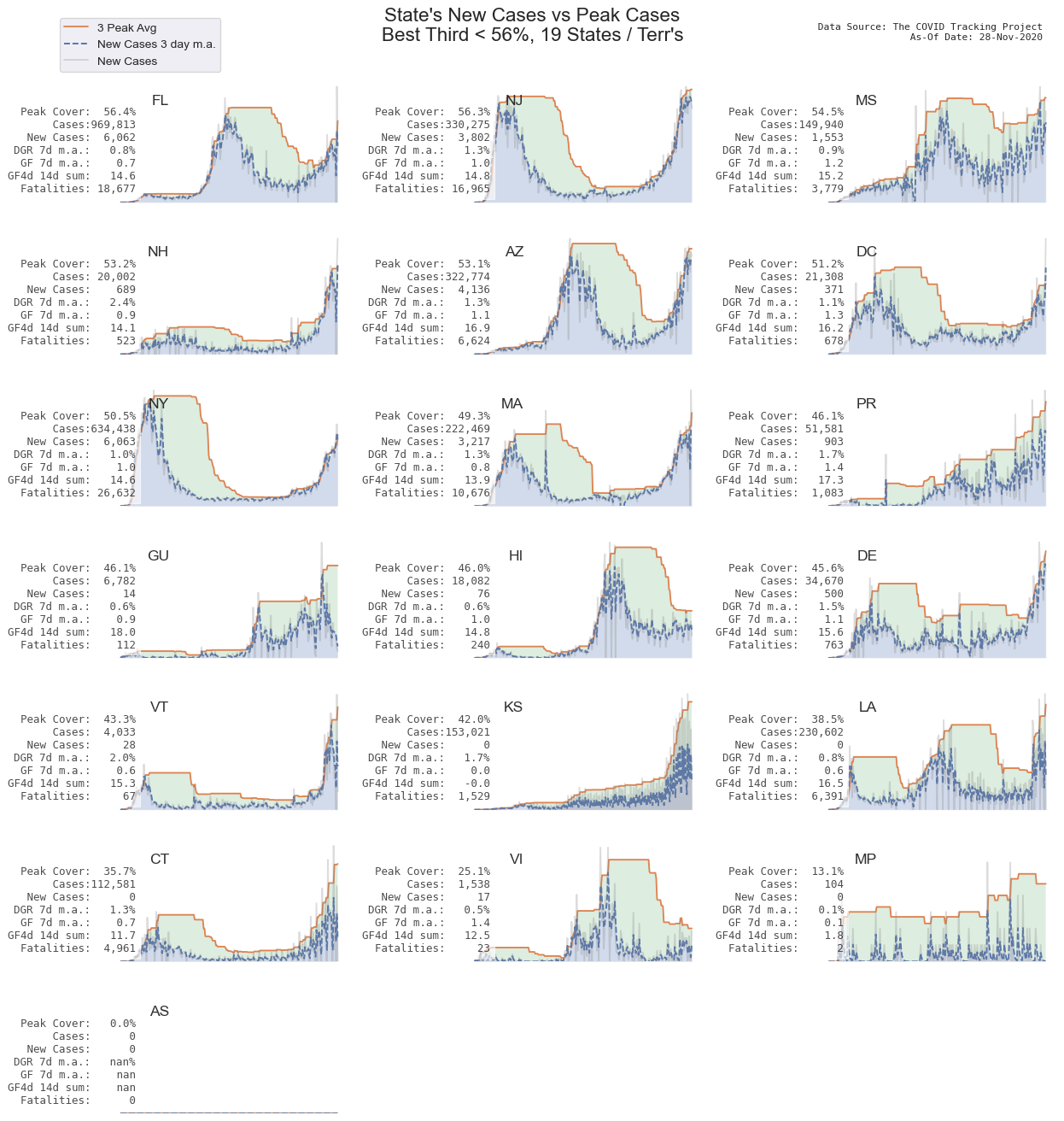
Proximity to peak cases
This section is a geometric analysis in which the area under peak number of cases (orange line) is compared to the actual cases (blue line and shaded area). The percent of peak area, bounded by the peak cases line, that is covered by the actual cases area, is a metric I call “Peak Coverage”. The higher the percent, the closer the state is to average peak conditions.
The peak line is defined by the average of 3 highest values in the last 8 weeks.
The visual explanation is more straight forward: The greater the green area, the greater the distance between new cases and peak cases. Simply: Mo’ green, mo’ better; No green, no good.
The states are sorted in decreasing order of peak cover.
States seeming near peak number of cases
States “in the middle”
States whose new cases seem under control
Coronavirus Tracking sites and Data Sources
-
Johns Hopkins Tracker – Dashboard tracking the global outbreak
-
worldometer – High Level coronavirus stats for all the countries in the world
-
The Covid Tracking Project – The most complete testing dataset I’ve found, aggregating information from state public health authorities
-
The New York Times Data Files – NYT compiles data at the state and county level from state and local governments
-
The New York Times Growth Tracker – Different data visualization tools to examine how fast coronavirus is spreading
-
University of Washington Institute for Health Metrics and Evaluation – Projections on when peak new cases and peak new deaths will happen along with impact to projected hospital resources
-
1point3acres – The core data is similar to other sites, but the visualizations are slightly different, and they are starting to track things like PPE requests and jobs (hiring and layoffs)
Citations and Notes
-
Data for these charts sourced from The Covid Tracking Project ↩ ↩2
-
The tl;dr label is often used to point out excessive verbosity or to signify the presence of and location of a short summary in case the reader doesn’t want to take the time to read the entire detail. Wikipedia Entry ↩
-
3 Brown 1 Blue for inspiration on calculating growth factor ↩
-
The logistic curve above is not a measurement, it is a model, and therefore it is an approximation. The goal is to provide some context of where we might be on the curve, based on the actual measurement and calculation of growth factor. ↩
-
The distance between time points on the plot is not fixed. The distance between t0 and t1, might be 30 days, while the distance between t6 and t7 might be 3 days. One complicating factor of epidemics is the feedback loop. We can influence what shape the outbreak takes. The total number of COVID-19 cases depends on us, and what we do. How quickly we flatten the curve depends on us, and what we do. Therefore, the duration between t5 and t6 is not a fixed number of days, but instead, depends on us, and what we do. ↩
-
Healthcare employment data from Kaiser Family Foundation ↩
-
Evidence Roundup: Why positive test rates need to fall below 3% ↩
-
Country Level testing summary from Wordodmeter Country Page ↩
-
The Whitehouse published guidelines for reopening calls for a “14-day downward trajectory” of declining metrics. Since “downward trajectory” is not precisely defined, this metric counts the number of consecutive days for each state that have a new case count less than the day before or less than or equal to 5. That is, for states with small case number (MT, HI, AK, VT, etc), the metric treats new cases equal to or less than a threshold of 5, the same as a day with declining case count. This metric is counting consecutive days, which may be more rigorous than actual Whitehouse / CDC Guidelines) as single day of increasing metrics will reset the consecutive day count back to 0, and the Whitehouse only calls for a “downward trajectory”. ↩ ↩2
-
Dr. Tatiana Prowell, a guest on Radiolab, Dispatch 3: Shared Immunity episode ↩