
Introduction
This is the first in a series of posts analyzing my investing performance in peer-to-peer lending products. In this series I aim to do two things:
-
Analyze my portfolio performance, and where possible place my performance in context of my particular peer-to-peer marketplace.
-
Discuss various investment strategies I’ve had over the years and refine my future strategy.
This series will not be a critique of any peer-to-peer platforms or services. The series is an exploration of my historical use of these financial instruments, did I utilize these instruments well, and if a suitable strategy can be found for future investing.
I write to find out what I am thinking…
Joan Didion
The primary driver for this analysis is a gut feeling my portfolio is under-performing. My plan is to start with broad exploratory analysis, and drill down if and when I find something interesting. The aim of this initial post and exploratory analysis is to establish a broad context of the problem space; if I am totally off base, more detailed analysis is pointless.
I’ll start with how I got into the retail peer-to-peer lending market in the first place.
Why Peer-to-Peer Lending - Search for Yield
In general, I have a preference for cash-flow generating investment strategies, and as a result, I frequently search for high yield investments. I was not old enough to invest in 10% Treasury Notes back in 1980, but I was old enough to jump on the first batch of internet banking accounts in the early 2000’s. My first internet banking account was with ING Savings, which with promotions, had interest rates from 5% to 7% . Needless to say the days of 5% interest rate on a checking or savings account are long gone.
With high-yield savings accounts no longer available, looking for yield requires looking at riskier investment products. The mainstream advice for yield, is generally recommendations that span money-market funds, bond funds, dividend paying stocks, and Real Estate / REIT Funds. I am invested in a some of these asset classes, but they each have drawbacks. Money-Market funds are below 2%; there are some high-yield bond funds with yields in 4%-7% range, but my portfolio is already heavily weighted towards the stock-market (if you own the stock of company A, is buying company A’s bonds, actually diversifying your portfolio? Additionally, I already own some bond funds.); I need an instrument with smaller initial investment amounts and more liquidity than rental properties. The mainstream options didn’t quite match my goals, so I started looking for alternative investment products.
One place I looked for alternative investments was the new at the time retail lending marketplace. The first institution I found offering investment instruments with low initial investments and reasonable liquidity was LendingClub. The hope was investing in retail loans would produce a stable 4%-7% yield on my cash investments to replace the high-rate savings accounts no longer available. I decided to experiment with LendingClub, and I started investing in retail loans in 2012.
Why Peer-To-Peer Lending - Affinity for the model
I first discovered peer-to-peer lending through micro-loans to help economies in developing countries. I was a relatively early participant of Kiva, funding my first micro-loan in November 2006. Through the experience of Kiva, I thought the peer-to-peer model would be promising in the United States and there were opportunities for a For-Profit institution to make a viable business.
The financial crisis of 2007-2009 reinforced some of my beliefs:
- Large numbers of credit-worthy folks fail to get access to capital via traditional lending institutions.
- Institutional investors have access to investing in retail loans that are only available to retail investors through mutual funds or similar instruments.
The combination of my very positive experience with Kiva, a belief that more credit-worthy folks should have access to capital than currently do, and a desire to “vote with my dollars” to support peer-to-peer lending as an alternative to traditional financing reinforced the decision to give LendingClub a try.
A nagging feeling
The last few years I’ve had a nagging feeling that LendingClub was underperforming for me; at least underperforming relative to my expectations, and underperforming based on the published interest rates on LendingClub website.
My account’s adjusted Net Annual Return(NAR) has been fluctuating between 1.95% and 2.25% for the duration of my LendingClub investing. On the positive side, I have not lost any principal and my portfolio has a positive return; additionally, anything higher than 2% beats most savings accounts these days. The nagging feeling comes from the fact that my portfolio performance, while not bleak, is a long way off from the 4%-7% expectations.
Analysis
Initial Hunch
These are credit products, and defaults are to be expected with any product based on lending. My initial speculation is that higher than expected loan defaults are the primary reason for my portfolio’s under-performance driving the associated nagging feeling. The remainder of this post will be analyzing my portfolio for the presence and impact of loan defaults.
In the LendingClub data Default means loan payment is severely delinquent while Charge Off means “no longer expecting payment” on this loan. Here is a full description of the different note status values on LendingClub.
Analysis will be based on Charge Off loan status, since that is the clear negative impact to the portfolio — no longer expecting repayment of principal or payment of interest owed.
Monospace font will be used to indicate a literal loan status, such as Charge Off or In Grace Period
Funding the Account
My general approach to funding the account was to deposit some funds into the account and re-invest all payments (returned principal as well as interest). I seeded my account with a few large deposits in 2012 and 2014. Starting in 2015 I moved to an automatic weekly deposit. In 2019, I was nearing a nice round number, so added a few large deposits to get to that round number; I have since stopped adding new funds. The chart below summarizes the annual deposits as well as the running total of funds added to my account.
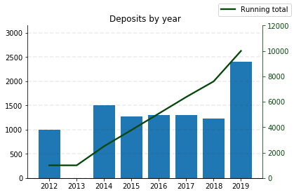
For demonstration purposes, the amounts related to my portfolio have been scaled to a total of $10,000 deposited.
Loan Purchases
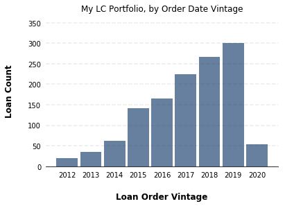
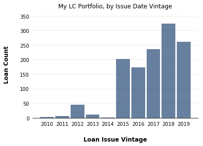
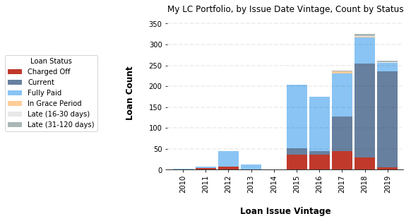
With money in my account it was time to make some purchases. The two charts below show (a) when loans were purchased and added to my account, which I am calling order date vintage, and (b) when the loans were actually issued by LendingClub, known as issue date vintage. For example, I might have purchased a loan in 2014 which was issued in 2011, the result is an order date vintage of 2014, and issue date vintage of 2011.
Not surprising, the loan purchases (order date vintage) chart mirrors the running total of deposits — as cash became available, more loans were purchased.
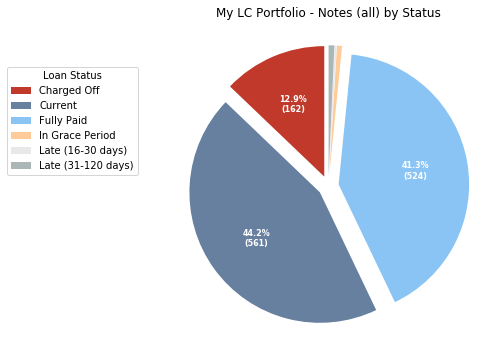
Current Status of the loans
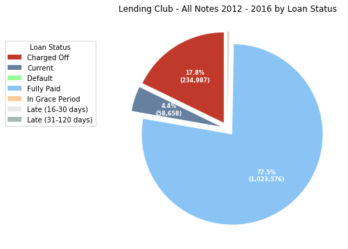
Below is a comparison of LendingClub historical loan data from 2012-2016, with the loan status of the notes in my portfolio. From a count perspective, the number of loans in my portfolio which have Charge Off status is favorable compared to the LendingClub historical data: My portfolio has approximately 13% of loans charged off, and the historical data around 18%. However, compared to the LendingClub historical data, my portfolio has 10x more Current loans; 44% vs 4%.
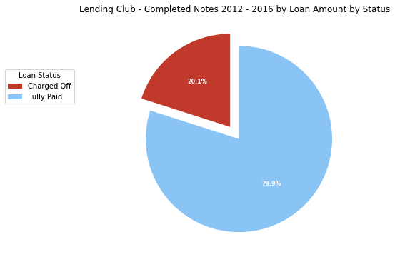
Completed Loans & Amounts
There are two fairly big skews in the charts above. (1) counts might not appropriately reflect the financial impact of a Charge Off and (2) a 10x difference in the portion of Current loans dilutes the impact of Charge Off’s.
To control for these possible distortions, the next analysis uses loan amounts, instead of merely counting the loans in each status, and to minimize the impact of the Current loans to the analysis, only Completed Loans will be analyzed.
Completed Loans for this article will be any loan with one of the following loan status values: Charged Off, Fully Paid.
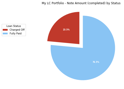
Looking only at completed loans my portfolio looks much less rosy compared to the historical data, with my portfolio having over 15% more Charge Off’s than the historical data: 23.5% vs 20.1%.
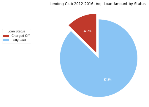
The preceding analysis used the full loan amount when calculating the sum total of charged off amount. This overstates the actual losses.
When a loan is charged off, the investor does not lose the full loan amount. Investors will retain any principal paid between when the loan was issued and last payment date; additionally, loan servicers will try to recover as much outstanding principal as possible. Adjusting the loan amount for Charge Off status loans can ameliorate this overstatement; the adjustment to loan amounts will done as follows:
Let
\[\begin{align} a &= \text {Loan Amount} \\ p_{rcvd} &= \text {Principal Received} \\ r &= \text {Recoveries} \\ A_{adj} &= \text {Adjusted Loan Amount} \\ \end{align}\]then adjusted amount is calculated as:
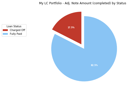
\[A_{adj} = a - p_{rcvd} - r\]The completed loan analysis with adjusted loan amounts, reveals my portfolio performed even worse than the full loan amount analysis above indicated. My portfolio had a 35% larger share of Charge Off’s compared to historical completed loans. 12.7% for historical data and 17.5% for my portfolio.
Distribution of losses
Now that we have a sense of overall size of Charge Off loans, the question is how are they distributed. Did I add a cluster of bad loans to the portfolio ? Are bad loans evenly distributed through all loan purchases ? To explore these questions a bit further, loan status grouping will be added to the loan purchases by date analysis.
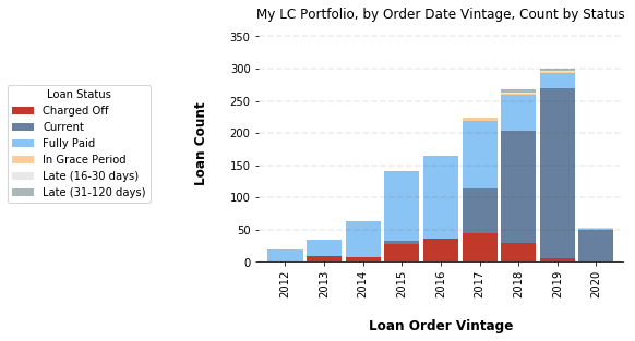
Visually inspecting the chart above, it’s clear we can rule out the “one big bad batch of loans” theory, and confirm that the presence of loans that ultimately reach Charge Off status seems to be fairly evenly distributed.
This seems to be a good breaking point as the next round of questions are aiming at additional detail, and the focus of this post is to stay high-level.
Recap
The genesis for this analysis was a nagging feeling my portfolio performance was less than stellar. Given the nature of the financial product, loan defaults are always a risk. Looking at a simplistic analysis based on loan status, my portfolio appeared to stack-up well against the historical data. The percent of Charge Off loans for my portfolio was approximately 13% vs 18% for the historical data.
It wasn’t until looking at the financial impact of those Charge Off loans that the relative underperformance of my portfolio became apparent. Using the face value loan amounts, my portfolio trailed the LendingClub historical data by 3.4 points. Using adjusted loan amounts, to account for principal received and other recoveries, actually extended this gap to 4.8 points.
Charge Off Comparisons:
| | My Portfolio | LC Historical |
|---|---|---|
| Loan Amounts | 23.5% | 20.1% |
| Adj. Amounts | 17.5 % | 12.7% |
Reviewing the research questions covered in this post.
Is my nagging feeling of underperformance justified?
It seems clear the answer is YES. The amount being lost, both loan amount and adjusted amount, as a percentage of cash invested for completed loans is significantly higher for my portfolio than the historical data.
Are the losses attributed to large “bad batch” of loans?
Analyzing when loans were added to my portfolio, and the final status for the loans, no single order vintage is obviously dominated by Charge Off loans. That is, no single bad batch of loans explains the large number of Charge Off loans.
The approach for this post, was to start the analysis with broad strokes and refine based on what was discovered. My initial thought was my portfolio performance was being dragged down by Charge Off loans, and the data suggests this is accurate. With the high-level picture supporting the initial assumptions, that failed loans have had an outsized impact on my portfolio’s performance, more detailed analysis is warranted. This additional analysis will be continued in a second post.
Part 2:
Coming soon. The high-level, exploratory analysis has given me a good feel for the data, and a few directions to pursue. As a teaser, here are some of the questions I am left with after completing the part 1 analysis.
Initial Questions for Part 2:
-
Is all LendingClub loans from 2012-2016 an appropriate benchmark for comparison. That is, how valid is comparing a set of 1.3 million loans compared to a portfolio approximately 1,300 notes. Perhaps random sampling of notes from historical data pool to build a benchmark portfolio of similar size would be a better benchmark.
-
What is the observed relationship of risk and loans reaching the
Charge Offstatus? -
Can I isolate different strategies and compare the return of each strategy? How do the manual purchasing strategies compare to the automated strategies?
As I work through the analysis, I’m sure I’ll a few questions to the list. I’ll start the number crunching shortly.
Reference Information
If you want to learn more about the analysis and tools used, or if you think you have a similar project you’d like help on, here is a project summary outlining more of the nuts and bolts of technical work for this post. Feel free to get in touch if you have any questions or comments.